Solargraf Solaris 2.0

Building a design system that humans and AI can build with.

Design System Token Architecture AI Design Engineering
3 months ✦ 3 designers ✦ Enphase Energy
In progress: Refining code components, testing and refining outputs
Figma Components
→→→→→
Code Components
→→→→→
Solargraf Product

my contribution

I worked across the system, from audit to AI-ready implementation.

01 Product & UX Audit Analyzed the existing Solargraf product and component library to identify visual inconsistencies, duplicated patterns, missing states, and opportunities for systemization.
02 Token Architecture Created the foundational token structure for color, radius, and spacing. Translated these into semantic tokens.

Owned: 3 / 10 variables
03 Component Design Designed and built reusable molecule-level components using the established variables, including form elements, alert banners, and composable patterns.

Owned: 5 / 32 components
04 AI-Ready Playbook Independently built the developer / AI playbook using Windsurf, translating the design system into reusable, code-ready building blocks.

Owned end-to-end

the need

Every new feature was creating more UI debt.

✦

Current design system was not scalable. Designers had to detach components to use them.

✦

5 different whites, 12 different greys. No clear source of truth for color decisions.

✦

AI tools were being adopted across PM and UX teams for rapid prototyping and stakeholder reviews. But without a shared design language in code, every AI generated prototype looked different from the actual product.

How might we create a system that makes consistency the default, instead of something teams have to maintain manually?

the audit

Before building the system, I mapped what already existed.

I audited the existing product, Figma library, and component patterns to identify gaps.

Visual inconsistencies

Colors · Typography · Spacing · Radius

Component gaps

Missing states · Duplicated patterns · Inconsistent variants

System gaps

Disconnected tokens · Hard-to-scale components · Limited documentation

→

12+ greys → consolidated palette

→

Multiple spacing values → defined spacing scale

→

Different buttons → standardized variants

→

Detached instances → reusable components

The goal was to reduce the number of design decisions teams had to make repeatedly.

the shift

A Figma library alone wouldn't solve the problem.

I wanted Solaris to become more than a Figma library. The same system should be understandable and usable by designers, engineers, PMs, and AI agents.

BEFORE
Figma → Handoff → Interpretation → Code → UI drift
  • ✕ Designers detach components
  • ✕ Engineers interpret spacing
  • ✕ PM reviews catch mismatches late
  • ✕ AI generates unrelated UI
AFTER · SOLARIS
Solaris → Shared language → Consistent UI
  • ✓ Components configure, not detach
  • ✓ Tokens enforce spacing and color
  • ✓ Reviews focus on logic, not pixels
  • ✓ AI builds with system context

the system

Solaris became a shared language for Solargraf.

The system was structured around three layers:

01
BRAND
The visual building blocks.
Colors · Typography · Radius · Spacing
02
SEMANTIC
Meaning and intent.
Primary action · Surface · Text · Border · Feedback
03
COMPONENT
How those decisions are consumed by UI.
Button · Input · Card · Form · Table

Brand defines what we have. Semantic tokens define what it means. Components define how the system behaves.

AI PLAYBOOK

Structured rules for AI-assisted development using Solaris.

Defines what AI should reuse, what it should avoid creating, and how it should handle gaps in the system.

tokens

From raw values to meaningful decisions.

Instead of scattering visual values across the product, we established a structured token system.

Brand tokens
blue-400
gray-100
spacing-4
radius-md
Raw, named values. The building blocks.
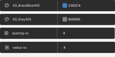
Brand token variables in Figma
→
Semantic tokens
action-primary
surface-default
text-secondary
border-default
Intent-based assignments. What it means.
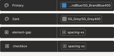
Semantic token mappings in Figma
Component usage
button-primary
input-border
card-padding
How tokens are consumed by components.
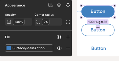
Component token usage in Figma

components

From reusable styles to reusable decisions.

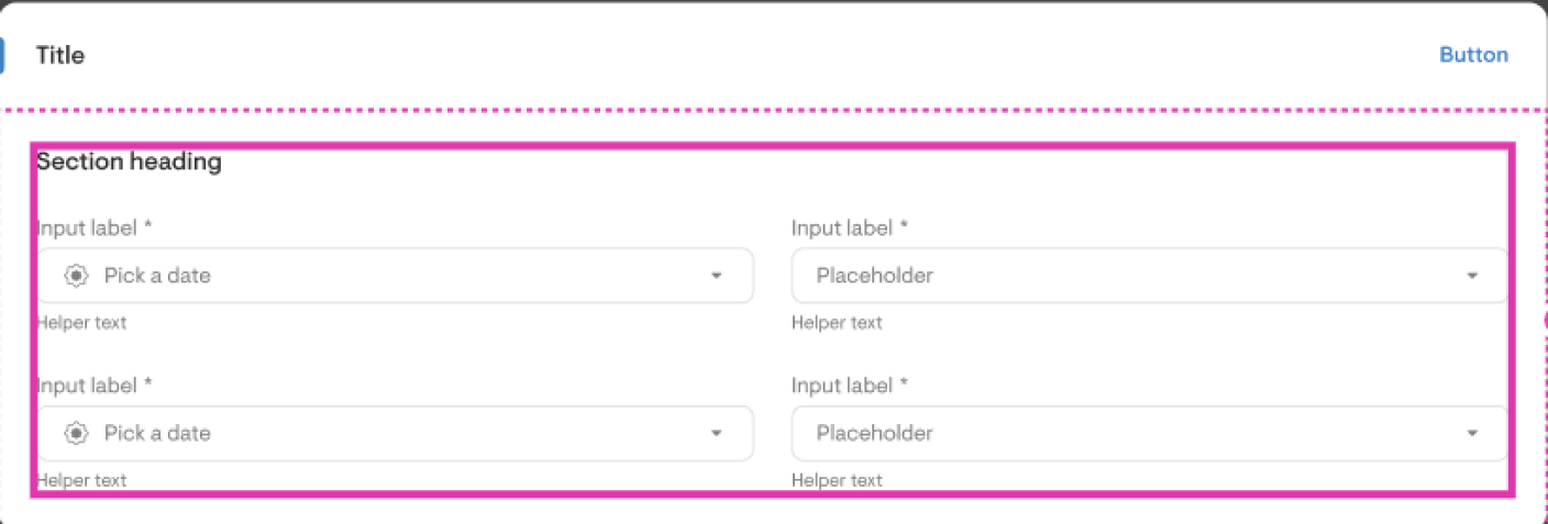
I translated the token system into a scalable component library with defined variants, states, sizes, properties, and behaviors. Components use Figma slots to define where child elements can be placed, making layouts composable and predictable for both designers and AI agents.

Component library showing form layout with slot indicators for composable structure

design → code

A component shouldn't stop at Figma.

The next step was connecting the design language to implementation. Reduce interpretation between what is designed and what gets built.

Button
FIGMA
Button / Primary / Medium
⋮
CODE
<Button variant="primary" size="medium" />
Input
FIGMA
Input / Text / Default
⋮
CODE
<Input type="text" state="default" />
Table
FIGMA
Table / Bordered / Compact
⋮
CODE
<Table variant="bordered" density="compact" />

the ai question

What happens when the builder is AI?

AI can generate a UI in seconds. But without product context, it also invents new colors, new spacing, new components, and new interaction patterns. So the design system needed to become machine-readable, not just human-readable.

WITHOUT CONTEXT
Prompt → AI → Generic UI
  • ✕ New colors
  • ✕ New spacing
  • ✕ New components
  • ✕ New interaction patterns
WITH SOLARIS
Prompt → Solaris context → Solargraf UI
  • ✓ Existing components reused
  • ✓ Semantic tokens applied
  • ✓ Established patterns followed
  • ✓ Accessibility preserved

The Solaris Playbook

I built a living React application that mirrors the Figma library. Every component in Solaris exists in code with its full set of variants, states, and configurations. This playbook serves as the single reference for designers, engineers, and AI agents.

Figma Components
→
React Playbook
→
Engineers + AI
Brand tokens
↓
Semantic tokens
↓
Component tokens
↓
React components
···→
brand.blue.500
↓
semantic.action.primary
↓
button.primary.background
···→
<Button variant="primary">
  Save
</Button>

the ai context layer

How Devs, PMs and Designers would consume it

I created structured Markdown documentation that captures not just what a component looks like, but how and when it should be used.

solaris/ ├── tokens/ │ ├── brand.md │ └── semantic.md │ ├── components/ │ ├── button.md │ ├── input.md │ └── modal.md │ ├── patterns/ │ ├── forms.md │ └── tables.md │ ├── guidelines/ │ └── accessibility.md │ └── AI_PLAYBOOK.md
Each component document describes:
✦Purpose
✦Variants
✦States
✦Usage
✦Don't use when
✦Accessibility
✦Code API
✦Figma reference

Documentation became a contract between design, code, and AI.

the system architecture

Two interfaces. One system.

Different people consume a design system differently. A PM shouldn't need to read Markdown. An AI agent shouldn't rely on visual browsing. So Solaris has two consumption layers built from the same source.

SOLARIS SOURCE
REACT PLAYBOOK
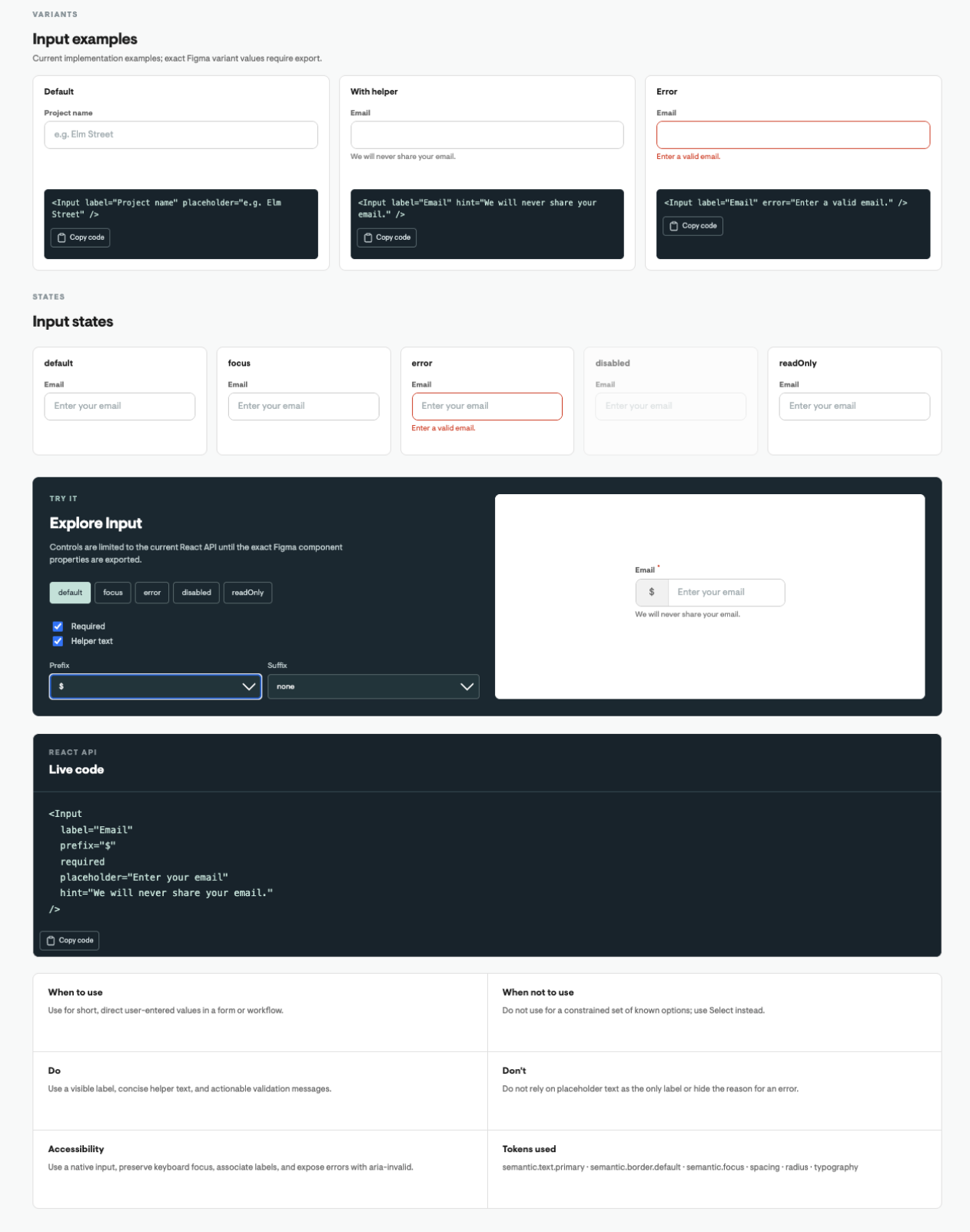
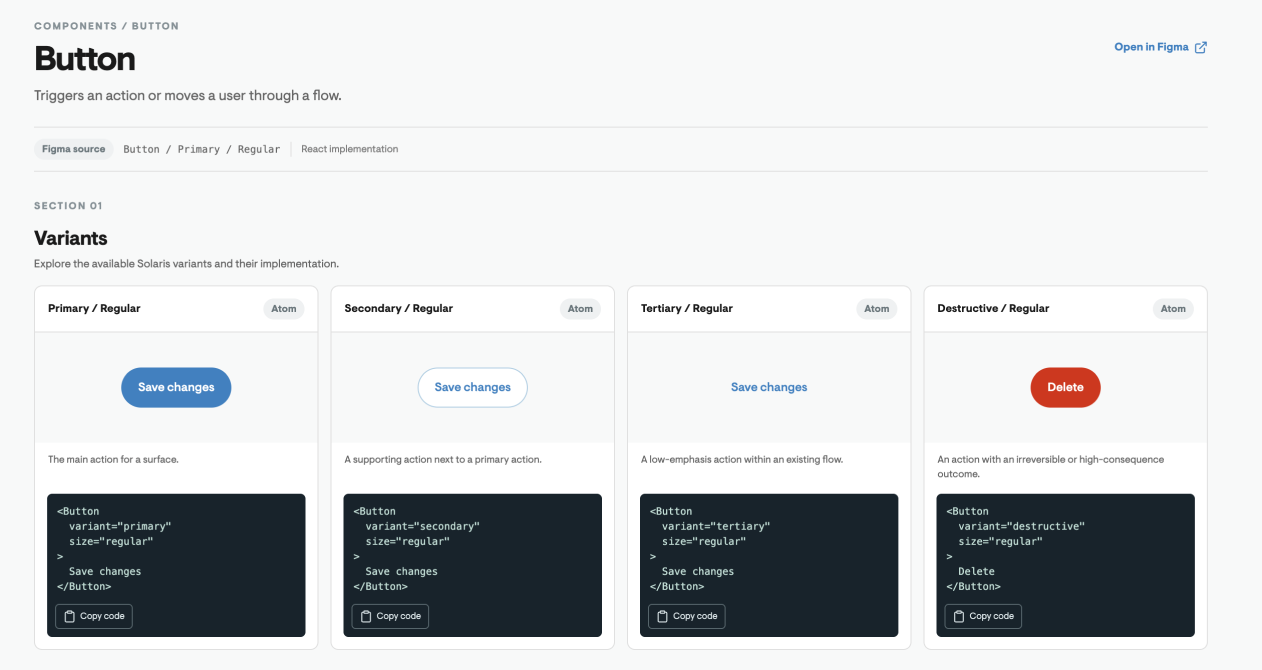
The human-facing interface

A living React application where every Figma component is replicated in code with its full set of variants. Designers and PMs can browse components, see usage patterns, and understand what the system offers without reading documentation files.

Makes things discoverable.

Designers · PMs
React Playbook showing Input component with variants, states, interactive controls, and live code
React Playbook showing Button component variants with code snippets
MARKDOWN FILES
The machine-readable layer

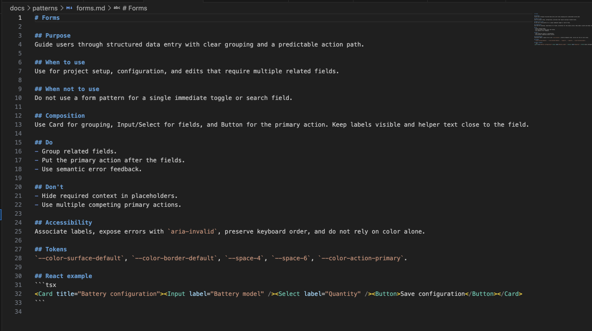
Structured Markdown documentation that captures what a component looks like, when to use it, and how it behaves. Each file follows a consistent schema so AI agents can parse and apply the rules without ambiguity.

Makes things machine-readable and precise.

Developers · AI Agents
Content guidance Markdown file with direct, task-oriented label rules
Typography guidelines Markdown file with font family and weight rules
Forms pattern Markdown file with purpose, composition, do/don't rules, accessibility, tokens, and React example

The Playbook makes things discoverable. The Markdown files make things precise. Together, they let every builder, human or AI, speak the same product language.

what I learned

A design system isn't just a library of UI components.

The most valuable part of Solaris wasn't creating reusable components. It was creating a shared language for making product decisions.

Tokens reduce visual decisions.
Components reduce interaction decisions.
Documentation reduces interpretation.
AI context reduces generation ambiguity.

Together, they create a system that can scale beyond the designer.

Solaris evolved from a Figma library into a shared language for designing, building, and scaling Solargraf, with a foundation that AI can understand and build with.